Tuesday, August 9, 2016


GREAT LINKS


A common feature I use on this page is the LINKS page.

I have added a few new links in the past few weeks and though I'd give you some information on the sections on the page.

Observations and Climate Data:
The first section on the links page has a bunch of good links to Observations and Climate Data. The links here will lead to a variety of observations data, including:


1. Basic instrument readings - such as temperatures,  dew point, winds and wind gusts, precipitation amounts and more...
  • This can be found the header: Observations
  • In that section there is a link to the "Federal Observation Report Handbook" which defines the observing, reporting, and coding standards for surface based meteorological reports. They are consistent with standards set forth by the Federal Government, the World Meteorological Organization (WMO) and the International Civil Avaiation Organization (ICAO) and the standards are only applicable to stations that have the capability to comply.  These are mostly METAR sites, co-located with airports or other aviation sites.
  • What is a METAR?  An international code (Aviation Routine Weather Report) used for reporting, recording and transmitting weather observations
                         
2.  Weather balloon observations - these are the upper air soundings or more technically Radiosonde Observations (RAOBs).  (Fact Sheet)
  • The basic observation data transmitted by a radiosonde on its way up through the atmosphere include: atmospheric pressure, temperature, humidity and wind speed and direction data.  Data is continuously reported from the surface level to as much as 20 miles high. 
  • All of this data can be used to determine many things about the state of the current atmosphere, a few of which include: amount of stability or instability, moisture content including at individual layers or the entire depth of the sounding, precipitation type, and much, much more!

MORE DESCRIPTION OF THE LINKS PAGE TO COME!  CHECK BACK HERE!


Tuesday, October 14, 2014

What do you want to know?

Are there any weather topics you want to know about?  


I haven'made many a blog post recently, but if there is anything you'd like to know about send me word.  Place a comment or send me an e-mail.

I will be happy to oblige any requests, whether they be about weather phenomenon or methods of analysis or forecasting.  Or if you would like some additional links to weather data.

I am open to any topic.

Have a great weather day.

Wednesday, November 20, 2013

Drawing a Jet Stream Map (Method 2)

Method 1 is basically finding areas of of peak wind speeds, circling them and connecting them.

Method 2 is basically following the tightly packed height contours around the trough and ridge patterns.

  • The basic steps for drawing a jet stream map, whether it is an analysis or a forecast model, can be broken down in easy steps.  
  • BUT REMEMBERyou don't have to be perfect.  When you are drawing a jet stream map you are making "an idealized or simplified map".  You are making a continuous line for something that, in reality, is not continuous and in fact can be displaced vertically.  
  •  A good tip: if you are able, looping through several forecast hours will give you better sense how things are flowing.
  • I also have a post with basic information on jet streams.

METHOD 2

Get the Level

1. Choose the appropriate level of the atmosphere.  Generally choose charts between 300mbs to 200mbs.  In an ideal depiction, choosing a layer (or slice) of the atmosphere would be more appropriate that just taking a paper a two-dimensional plane.  But, I and you, work with what is available and in the time constraints we have.
  • During cold seasons, the 300mb chart might be of better use, since the air is more cold and dense in the vicinity of the jet stream during the cool season. 
  • During the warm seasons, the 200mb can be used but anywhere in that range is good.
In the example for this method, I choose the 250mb level from HPC.  See Image 2.

Basic Assumptions

Some simple assumptions between the jet stream and height contours:

  • the jet stream follows the trough and ridge pattern and these can be found in the height contours 
  • more tightly packed height contours implies higher winds (higher "gradient").
Now the assumptions assume that you know what a height contour is and what ridges and troughs are. Here is a simple map (Image 1).


Image 1

Image 2 is from the NCEP Model Guidance website.  It is a depiction of 250 mb heights, 250 mb winds (in knots) and  isotachs.   The heights are the curving black lines.  The winds are the smaller wind barb lines. The isotachs are the shaded areas, basically areas of similar wind speeds.

As a matter of interest, I've identified the positions of the mean trough (dashed blacked lines) and mean ridge (herringbone or zig-zag line).


Image 2

What do tightly spaced height contours look like?


As stated above, Method 2, is basically following the tightly spaced height contours around the trough and ridge pattern. A quick look at what I mean by "tightly spaced" is see in Image 3.


I have placed red lines of equal length in the map.  They are perpendicular to the height contours (the black curves lines).  Areas where more height contours intersect the red line can be consider tightly spaced.


For example, Point A intersects five (5) height contours, while Point B and Point C intersect one (1) and three (3) height contours, respectively.  You can see that the region around Point A has higher winds speeds (indicated by the blue shading and the wind barbs), while Point B and C have comparatively light winds.   The higher winds speed locations are in areas where the "gradient" is higher.


A gradient is basically a rate of change over distance.  In this case, heights changing more rapidly over a distance equates to higher wind speeds.  Why?  I will likely address that in a later blog.


Where the jet stream lays in this example is basically a relation of relatives.  We want to follow the high contours where they are more tightly packed relative to other areas.


There are generally two (2) North American Jet Streams: the Polar Jet and the Sub-tropical Jet.  When making weather maps for the general public, it may not be necessary to outline both but at least know they are there.


Pop Quiz: Of the three points (A, B and C) which has the lowest winds and why?  Leave a comment to answer.


Image 3

Just draw the map already, Jeffrey!


So let's get to it.


In Image 1 and 2, we saw where the basic trough and ridge axis area lay.  In Image 3, we've located one area of tightly packed contours (relative to areas where they are less tightly packed).  So now we want to draw the jet stream.


Just draw a line that is parallel to the height contours, centered on the most tightly packed height contours.  My result is in Image 4.  The Polar Jet is indicated by the gold-toned line.


I could have also drawn the Sub-Tropical Jet.  Where would you have drawn it?  Leave a comment to answer.


Image 4

So that is it!


If you have any questions or comments, leave them below or send me a message.


Monday, November 18, 2013

Watch vs. Warning vs Advisory: What does it all mean?!

DEFINITIONS

What is the difference between all the products the National Weather Service (NWS) issues?   
I found a list of all the products the NWS generates.  I'm not going to itemize them all, but at last count there were about 330 separate identifiers!  But I'm not here to talk about all those. Heck no!  

I'm here to go over the difference between:
  • WATCH,  WARNING, and ADVISORY
Here are the NWS definitions if you are interested:
  • WATCH: A watch is used when the risk of a hazardous weather or hydrologic event has increased significantly, but its occurrence, location, and/or timing is still uncertain. It is intended to provide enough lead time so that those who need to set their plans in motion can do so.
  • WARNINGA warning is issued when a hazardous weather or hydrologic event is occurring, is imminent, or has a very high probability of occurring. A warning is used for conditions posing a threat to life or property.
  • ADVISORYHighlights special weather conditions that are less serious than a warning. They are for events that may cause significant inconvenience, and if caution is not exercised, it could lead to situations that may threaten life and/or property.


WHAT DOES IT ALL MEAN?

Basically this translates to degrees of certainty and impacts.


A WATCH is generally issued when meteorologists are forecasting a weather event with possible severe impacts.  The weather event is not certain, but the possibility of severe impacts are worth informing the public about.   

WARNING is generally issued when there is high confidence that a weather event with severe impacts is occurring or is expected to occur in the near future.

An ADVISORY is generally issued when there is high confidence that a weather event will occur, BUT the impacts are expected to be less than severe. 


Watches, warnings and/or advisories can be issued independently of each other.
  • Basically the issuance of a WATCH means WARNING impacts are possible, but it is not certain. 
  • However, the issuance of a WATCH does NOT guarantee a later WARNING.
  • A WATCH is NOT issued when only ADVISORY impacts are expected.  
  • However, it is possible for a meteorologist to forecast WARNING impacts, issue a WATCH, but later forecast models indicate of impacts will not be severe, resulting in "only" an ADVISORY being issued.
  • Then again, it is possible for a forecaster to see possible "non-severe" impacts but later forecast models indicate impacts will be severe, resulting issuance of a WARNING without 


CRITERIA

But what is a "significant/severe" impact?  If you, as an individual,  experience any weather event it may have significant or severe impacts on you.

The NWS generally has criteria to determine whether something constitutes a watch, warning or advisory.   And the various types of weather variables begins to expand the list of possible watches, warnings or advisories. 

The NWS monitors variables for cold and warm season.

COLD SEASON VARIABLES

The NWS has different criteria for many of these variables, whether it be a WATCHES/WARNING/ADVISORIES for:

SNOW and/or HEAVY SNOW, FLOOD, COLD, FREEZING RAIN or ICE STORM, or BLIZZARD...etc.


WARM SEASON VARIABLES

The NWS has different criteria for many of these variables, whether it be a WATCHES/WARNING/ADVISORIES for:

SEVERE THUNDERSTORM, TORNADO, HEAT, DUST, HURRICANES or TROPICAL STORMS...etc.

It would be too much to go into all of the critieria or thresholds in each Weather Forecast Office across the United States or wherever you may be.   BUT if there is something specific you are looking for leave a comment or contact me.

Here is the description of the Snow Criteria from the website of National Weather Service in Spokane, Washington (USA):

"The NWS issues Snow Advisories for the Columbia Basin and the valleys for 2-3 inches of snow in 12 hours or 3-5 inches of snow in 24 hours. In the east slopes of the Cascades, snow advisories are issued for 6-11 inches of snow in 12 hours or 6-17 inches of snow in 24 hours.

The NWS has different criteria for heavy snow for different areas of the Inland Northwest. A Heavy Snow Warning is required if 4+ inches of snow in 12 hours or 6+ inches of snow in 24 are expected in the Columbia Basin and the valleys. For the Northeast Mountains, the Panhandle mountains and the Okanogan Highlands, 8+ inches of snow in 12 hours or 12+ inches of snow in 24 hours prompts a heavy snow warning. A heavy snow warning for the east slopes of the Cascades requires 12+ inches of snow in 12 hours or 18+ inches of snow in 24 hours. In the Blue Mountains, 12 + inches of snow in 24 hours is needed for a heavy snow warning.

Blizzard conditions exist when sustained winds of 50 mph or more with considerable falling and drifting snow, causing visibilities to drop to near 1/4 mile for at least 3 hours. Though there are no temperature requirement, temperatures that fall below 20 degrees F under these conditions can lead to life-threatening, sub-zero wind chill readings."

Sunday, November 17, 2013

The Jet Stream and the General Public

I'm a meteorologist or a weather person and I generally love the weather.  I love to try to figure out what it is going to do and why.  The "nuts and bolts" of it is interesting.

But let's face it, 99% of the time a forecaster is forecasting for the general public and only a small percentage care about those "nuts and bolts".

So why show a jet stream map?

Three (3) basic traits the jet stream can illustrate:

(1) Air Mass Character:  Colder air is north of the jet stream and warmer air is south of the jet stream, relatively speaking. (See Image 1)

Image 1


(2) Changing weather patternsHow the jet stream changes over time will be associated with changes in weather.  (a) the jet stream axis dipping south (a.k.a troughing) will bring colder air in (b) the jet stream axis lifting north (a.k.a. ridging) will bring warm air in. 

Example: in Image 2 a large surface low (big "L") off the Pacific Coast at hour 0 (i.e. right now) moves toward the coastline at hour 0+24 (i.e. 24 hours later).  Another large surface low (big "L") near the Great Lakes moves toward Maine in the same time frame.  The colder air over the Pacific Northwest, Rockies and Canada shifts toward the Plains and Great Lakes and Warmer air shifts toward the Pacific Northwest. 
Image 2


(3) System movement: The jet stream may simply steer features along, rather than be a part of air mass changes.  A lot this has to do with the "scale" of the system.  Generally features will be on the 'small' scale, such as: jet streaks, weak and shallow shortwave troughs, small areas of low pressure.


Example: in Image 3, a small feature (indicated by a small "L") move in from the west, it is steered along the jet stream. (The time steps are relative.)  


NOTE: sometimes systems get "cut-off" from the main this "steering" flow and may "wander" around the atmosphere until a stronger system comes to pick it up.


More "advanced" features of the jet stream:

Most of these "advanced" features are related to locations of enhanced upward and downward motion. In the world of weather upward motion is associated with the development of clouds and/or precipitation and downward motion is associated with the inhibition of clouds and/or precipitaton.
  • Jet streak (or jet max): an area of locally higher winds within the jet stream.
  • Jet streak coupling: when 2 jet streaks come together.
  • Jet streak curvature: location within a trough or a ridge impacts upward/downward motion 
  • Jet streak location: location of a jet streak within the larger scale flow can give clues as to whether a system will continue to strengthen or a system will begin to weaken.
  • Low Level Jet (LLJ): A region of relatively strong winds in the lower part of the atmosphere. Generally NOT as strong as the upper level jet stream (ULJ)
I will address these in more depth in a separate blog post.

Wednesday, November 13, 2013

Drawing a Jet Stream Map (Method 1)

Method 1 is basically finding areas of of peak wind speeds, circling them and connecting them.

Method 2 is basically following the tightly packed height contours around the trough and ridge patterns.
  • The basic steps for drawing a jet stream map, whether it is an analysis or a forecast model, can be broken down in easy steps.  
  • BUT REMEMBERyou don't have to be perfect.  When you are drawing a jet stream map you are making "an idealized or simplified map".  You are making a continuous line for something that, in reality, is not continuous and in fact can be displaced vertically. 
  •  A good tip: if you are able, looping through several forecast hours will give you better sense how things are flowing.
  • I also have a post with basic information on jet streams.

METHOD 1

Get the Level

1. Choose the appropriate level of the atmosphere.  Generally choose charts between 300mbs to 200mbs.  In an ideal depiction, choosing a layer (or slice) of the atmosphere would be more appropriate that just taking a paper a two-dimensional plane.  But, I and you, work with what is available and in the time constraints we have.
  • During cold seasons, the 300mb chart might be of better use, since the air is more cold and dense in the vicinity of the jet stream during the cool season. 
  • During the warm seasons, the 200mb can be used but anywhere in that range is good.
Here is a forecast model I choose, the GFS at 300mbs, for the morning of Friday, November 15th, 2013.   It is provided by Unisys Weather

Image 3

Where are the higher winds?

2. Circle the locations of higher winds. This can be done in a couple ways.  Many forecast models show shading, like the one I choose.  There is usually a scale included (see Image 3 above).  

Sometimes models include only wind barbs.  Such as in the image below.

Image 4

In either case, start by drawing circles contours around the areas winds, generally above 50 kts to 80 kts.  Below is rough example (Image 5).  They don't cleanly hook together do they?  In the real atmosphere they usually don't.

Image 5

Find the Core


3. Draw jet core lines: within the general area of higher wind speeds done in step #2, draw lines centered at highest wind speeds, and draw them in the direction of the wind flow.   
  • Generally winds flow from west to east, but can also dive from north to south or from south to north (and in some cased west to east.  
  • Wind barbs, like in the example above (Image 4), are placed where the winds are coming "from". In the (Image 4) example, in the Blue Print Example, it shows northwest winds.  
  • In some forecast model depicts they show arrows, like the Image 5, above.  This generally shows the direction the winds are flowing to.  
  • That is a subtle difference but it is import to know, otherwise you may be "steering" your systems in the wrong direction.  
I did some loose connections in the image below (Image 6):

Image 6

Plot the Jet Stream

4.  Make an approximate Jet Stream location.

Looking at the rough connections I made above (Image 6). I begin to connect lines, making some assumptions and keeping some things in mind:
  • This is an idealized map. 
  • I want smooth lines.  
  • I will ignore some of the more "incongruous" 
  • I will follow the flow of the wind field and the 300mb height contours (the lines in white).
My approximate jet stream location is see in the image below (image 7), as the thick white line. Notice there are two basic jet streams on this map, the northern polar jet and the southern subtropical jet.  Also, notice I didn't include every area of higher winds in the jet stream (specifically the higher winds around West Virginia into southern Pennsylvania).

Image 7


Other things to keep in mind when drawing a jet stream map:


  • Jet streams flow around are areas of high and low pressure in the mid-latitudes.  .
  • Generally when these idealized jet stream maps are shown, think about why you want to show them? 
  • Oftentimes they can be good for showing differences in air masses. 
  • Generally, when I think of jet stream maps and forecasts:  if my area is north of the polar jet, I'm expecting cooler air. If my area is south of the polar jet, i'm expecting milder air.
  • That is a "dirty" assumption but it is good for general usage.  
  • There are other things that come into play, such as whether there is a trough of low pressure over the region or a ridge of high pressure.  A trough of low pressure coming into the area, with the jet stream axis that was formerly north of the region now pushing south, generally means a cooling trend.  The opposite generally means a warming trend.


5.  Finalize the Jet Stream location (and if you desire) make it pretty:


I would make the lines smoother, if I were doing it for television.  The base map is there for a comparison.  


Image 8
If there are any questions or if you would like more examples, just send me a message in the Contact Me Section.

Jet stream.

What is the jet stream?

In the simplest terms
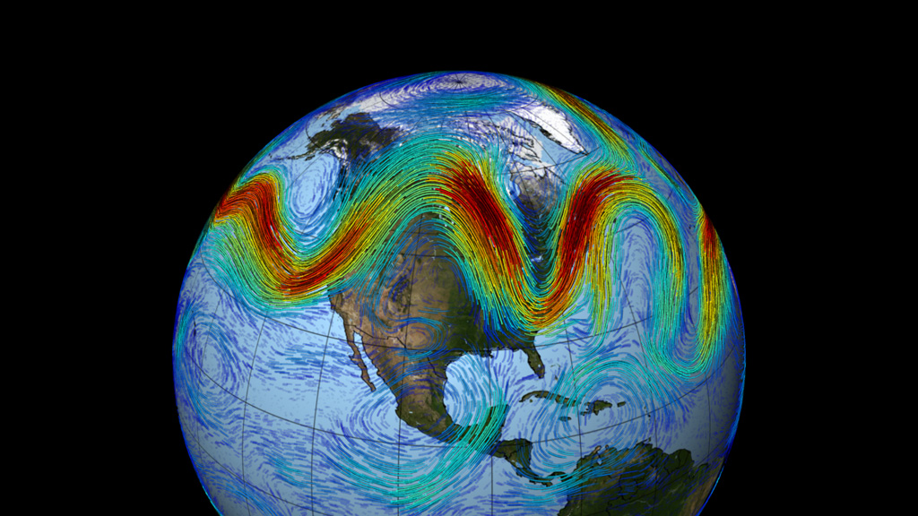
  • Jet streams are relatively narrow bands of strong winds in the upper levels of the atmosphere. 
  • The winds blow from west to east in jet streams -- but the flow often shifts to the north and south. 
  • Jet streams follow the boundaries between hot and cold air OR a stream forms directly over the center of the strongest area of horizontal temperature difference.
  • Since these hot and cold air boundaries are most pronounced in winter, jet streams are the strongest for both the northern and southern hemisphere winters.
  • Jet streams steer weather systems.
  • Jet streams are often the location of frontogenesis or the development of low pressure systems.  These ideas are for another lesson. 
  • Oftentimes television meteorologists indicate a jet stream as a line on a map. This line generally points to locations of the strongest wind. 
  • How to draw a basic jet stream map: Method 1 and Method 2.


Complexities
In the reality the jet stream is more complex.  In the real atmosphere, jet streams are wider and discontinuous; they are a region where the wind increase toward a core of strongest winds.

One way of visualizing this is to consider a river. The river's current is generally the strongest in the center with decreasing strength as one approaches the river's bank. It can be said that jet streams are "rivers of air".  Click on the image below for a loop, courtesy of NASA's Goddard Space Flight Center


The jet stream is driven by broader planetary circulations.  The actual appearance of jet streams result from the complex interaction between many variables, including:

  •  the location of high and low pressure systems, warm and cold air, and seasonal changes. 
Jet streams meander around the globe, dipping and rising in altitude and latitude, splitting at times and forming eddies, and even disappearing altogether to appear somewhere else.

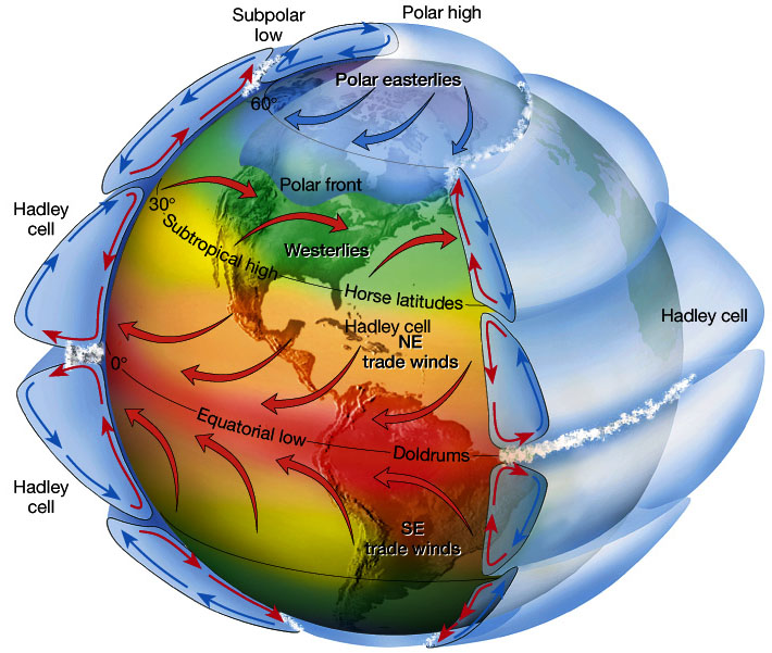
Here is a quick look at the idealized model of global circulation patterns that drives the jet stream:


Image 1
Image 2

I stated above that the jet stream is driven by broader planetary circulations.  In simple terms: these planetary circulations themselves are driven by: (1) the rotation of the earth and (2) differential heating between the equator and the north pole.  The image above shows the primary circulations in the northern hemisphere.  (Similar circulations occur in the southern hemisphere). 

Now the atmosphere as a whole is always in motion.  Why?  It's our Sun.  The Earth is unevenly heated and the uneven heating creates a circulation.  

One of my college professor's said something like: everything is looking for equilibrium.  The atmosphere is always looking for equilibrium, a state of balance.  I supposed it can be likened to to strange game of "whack-a-mole".   If one things moves out of place, there is a reaction to put it back in it's place.   It's a cause-and-effect relationship (which can be seen as Newton's Third Law of Motion: For every action there is an equal and opposite reaction.)  Or in simple math terms: both sides of the equation must balance out. 

Here is a brief look at atmospheric circulations as seen in the image above (Image 2), i.e. the Hadley Cell, Polar Cell, and Ferrel Cell:

Hadley Cell - it is a thermally (heat) driven closed-circulation loop, between the Equator and 30 N.

  • Strong solar heating at the equator leads to at the rising air; creates an equatorial low pressure zone or better known as the Intertropical Convergence Zone (ITCZ)
  • Aloft, air moves poleward but acquires a west to east motion (due to the Earth's circulation).
  • Air descends at 20°- 30° latitude to form's subtropical highs.
  • Air moves towards the equator at the surface (to replace the rising air) and a weak Coriolis force creates the NE trade winds.
Polar Cell -  it is a thermally driven closed-circulation loop, between 60N and the North Pole. While cooler and drier, as compared to the atmosphere at the Equator,  there is sufficient differences/gradients in temperature to force similar rising motion near the 60° and sinking motion at the North Pole.

  • Creates relatively warm "Sub-polar" Lows
  • Created relatively cold "Polar" Highs.
  • Air flows from high to low, i.e. the Pole toward 60°, i.e. equator-ward.
  • Coriolis forces direct the surface winds to the west, creating polar easterlies.

Ferrel Cell: this is a secondary circulation feature, more dependent on the Hadley and Polar Cells and, to a great deal, is influenced by the high and low pressure areas of the mid-latitudes.  It is not a true "closed-loop" circulation.  It is marked by an area known as the Prevailing Westerlies.

  • Air flows north away from the sub-tropical high toward the subpolar lows (i.e. 30° to 60°). 
  •  In the Western Hemisphere this is the location of United States
  • The base of the Ferrel Cell is characterized by the movement of air masses.  
  • The location of air masses is influences by the location of the jet stream.
  • The upper Ferrel cell is not well-defined, partly because it is the intermediary between the Hadley and Polar Cells.
Cause of Jet Stream

So what causes the jet stream to occur? 

In general:

  • Winds are strongest immediately under the tropopause. 
  • If two air masses of different temperatures or densities meet, the resulting pressure difference caused by the density difference (which causes wind) is highest within the transition zone. 
  • The wind does not flow directly from the hot to the cold area, but is deflected by the Coriolis effect and flows along the boundary of the two air masses

All these facts are consequences of the thermal wind relation.  This is beyond the discussion of this lesson, but the balance of forces on an atmospheric parcel (i.e. a conceptual "chunk of air") in the vertical direction is primarily between the pressure gradient and the force of gravity, a balance referred to as hydrostatic. In the horizontal, the dominant balance outside of the tropics is between the Coriolis effect and the pressure gradient, a balance referred to as geostrophic. Given both hydrostatic and geostrophic balance, one can derive the thermal wind relation: the vertical gradient of the horizontal wind is proportional to the horizontal temperature gradient. This means that temperatures decreasing polewards implies that winds develop a larger eastward component as one moves upwards. Therefore, the strong eastward moving jet streams are in part a simple consequence of the fact that the equator is warmer than the north and south poles

On Earth, in the atmospheric circulation model briefly described above, this generally occurs at the intermediary location between the Hadley and Polar Cells.  And more specificially there two (2) jet stream locations, the Polar Jet (at the intermediary between the Polar and Ferrel Cells) and the Subtropical Jet (at the intermediary between the Hadley and Ferrel Cells.


Polar Jet Stream:

The thermal wind relation does not explain why the winds are organized in tight jets, rather than distributed more broadly over the hemisphere. 

One factor that contributes to the sharpness of the polar jet is the undercutting of sub-tropical air masses by the more dense polar air masses at the polar front. 

Look at Image 2 above.  In the idealized circulation pattern, the southern side of the Polar Cell (i.e. near 60° )  is "tucked" under top of air of the Ferrel Cell at the same latitude.
  • This causes surface low pressure and higher pressure at altitude. This is an area of steep pressure gradient.
  • At high altitudes, lack of friction allows air to respond freely to the steep pressure gradient with low pressure at high altitude over the pole.  
The polar front jet stream is closely linked to the frontogenesis process in midlatitudes.
  • The acceleration/deceleration of the air flow induces areas of low/high pressure respectively, which link to the formation of cyclones and anticyclones along the polar front in a relatively narrow region.  That is more for another lesson.
The mean or average location of the Polar Jet varies from season to season and is largely due to differences in heating.  It is generally weaker and further north in the Summer and stronger and further south in the Winter.  Here is an image of the average location of the jet stream in the winter versus the summer over the United States:

Sub-tropical Jet Stream:

This forms similar to the polar jet stream, however this is generally weaker than its poleward cousin because the thermal gradient is less defined.

Drawing a Jet Stream Map: Method 1 and Method 2.

The basic steps for drawing a jet stream map, whether it is an analysis or a forecast model, can be broken down in easy steps.  Click on the links above for information.